The Same, Only Different: Reclassifying Serve Reception in Volleyball, part 1
Why measure serve reception one way when we can measure it 2-3 different ways?
This is part two of a three-part series. Read the other parts by clicking on the links below.
I wrote about serve reception in a previous post (read it here) and my thoughts there were a bit more philosophical than technical. I want to build on some of the ideas in that post and add some data before giving some ways to integrate the ideas I present. So here goes...
I haven’t changed how I grade receptions in the past few years but I have expanded how I think about serve reception to include its contribution to scoring points. This expansion is a product of treating all non-terminal skills (receiving, setting, digging) not as isolated skills but as opportunities to either make it harder or easier for our team to score on the next attack. In the case of serve reception, pass average and in system percentage both treat passing as an isolated skill so how can we incorporate scoring into our passing evaluation?
Before I get into that, I think it is important to quickly look at how I grade passing. To be clear, I don't think that my way of grading is better than other ways, it is just an expression of what I think is important and that can vary from one program or analyst to another. I think it is important to explain my grading because it influences the data that underlies everything else I'm writing about. First, I grade on a four-point scale so a "four" is a ball passed within a step or so of the setter's "perfect" location while also allowing the setter to be in a desirable posture. “Threes”, “twos”, and “ones” are basically determined by how many options I think the setter reasonably can set on the pass (there's a difference between can and should, which I wrote about here). I use Data Volley/Volleystation's R/ grade for "one-half" receptions, which are passes that are kept in play but the receiving team cannot attack. This grade is useful to make "one" grades more connected to scoring points without being affected by the noise of shanks and overpasses that aren't aces.
The data set that I'm using is the last seven years of Pac-12 matches involving the University of Colorado, where I am the Technical Coordinator. The graph below is built in Tableau, which is a really fun and powerful data visualization tool.
Let's remember that I said scoring is what drives my work here. Reception is a step towards scoring, but scoring is what really matters. Passing to target is nice but such passes are ultimately useful because they make scoring easier. So let's approximate how well teams score after different reception grades. The graph pictured above is built on reception grades (x axis) and expected first ball efficiency (y axis). To find expected first ball efficiency (xFB), we'll need the number of times each attack outcome (K, 0, E/B) occurs following a particular reception grade and the number of times that particular reception grade occurs. xFB will be calculated in the same way we calculate attack efficiency with one crucial difference. I am using reception attempts as the denominator rather than attack attempts because this calculation is about the passer rather than the attacker so I want to include receptions that don't have an attack that follows. The calculation for xFB after a “four” pass looks like this:
Each reception grade has its own calculation so each team has five points on the graph above and these points correspond to the xFB for that reception grade for that team. I asked Tableau to show curves to relate each team's data points to one another so each team has one curve that roughly links their five points together, giving us a sense of how the values change as we move from grade to grade. I then grouped together teams that had similar curves to pool their data together. The way xFB changes from grade to grade is what triggered my thinking around reception evaluation.
The conclusions I draw from this visualization are not exactly universal but I think that the highlighted group of teams are common enough that my conclusions about them can be useful for many other teams. Let's start at the top end of the grade scale, “fours” and “threes”. This group of teams shows that there is little difference between these two kinds of receptions in terms of how well teams attack after such a reception. (These teams average hitting around .350 in system.) That makes sense because there is probably less difference between what “fours” and “threes” look like than the difference between any two other grades. (This could be an argument against scoring on a four-point scale but that's not what I want to focus on here.) We see a decent gap between xFB on threes/fours and xFB on “twos”, which is important because that means “twos” are clearly different than “threes” and “fours” in terms of a team’s ability to score. Better teams in the conference score less on their first swings when they pass “twos” than if they pass better. Just like with “threes” and “fours”, this makes sense but it is important to see how large a difference in xFB there is (around 60 points). It is worth noting that, even though there is a drop in xFB, teams can still be reasonably successful, hitting around .290 in their first ball offense but they start to put more pressure on other aspects of their game if they are scoring less in their first ball offense. There is an even larger drop between “twos” and “ones” (from .290 to .130) and now teams are entering dangerous territory because it will be really hard to win if they are only hitting .130 in first ball. The important thing to take away from this is that there are reasonable ways that I can group reception grades together when I consider how well teams attack after those reception types.
I see three groups of receptions: ones after which teams hit well over .300, ones after which they hit high .200s, and ones after which they low .100s or worse. I see these three groups as being either favorable for scoring, slightly below average for scoring, or poor for scoring. I could easily stop here and just assign new number values to my reception grades but that doesn't connect the skill to scoring in any meaningful way. Why not just use In System Percentage (IS%) to express the same idea? I think there are two reasons, IS% doesn't connect to scoring and IS% ignores that a team can still win passing “twos”. IS% is certainly useful but it doesn't accomplish what I'm looking for. After thinking about alternative scales, I arrived at Green-Yellow-Red (G-Y-R). Using this scale is helpful because it reminds us of traffic lights and gives us a sense of the situations that attackers find themselves in after a reception: favorable, questionable, and difficult. G-Y-R allows me to continue grading serve reception in the same way I have been, as an expression of the number of front row attacking options that are available, but now I have a way to talk about how reception affects scoring. (I also include a 0 category for aces and shanks but I didn’t include it in the name of the system. The “zero” here refers to how likely a team is to score, not the grade of the reception.)
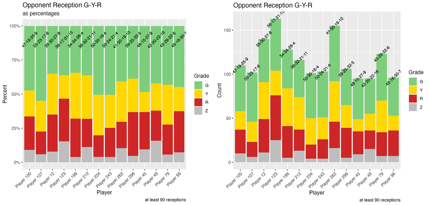
Here are two different visualizations that are showing almost the same thing, G-Y-R reception frequencies for opponent passers. Each bar in these stacked bar charts represents a different passer and the colors represent how often that type of reception occurred for that passer. The numbers at the top of each bar are numerical expressions of each passer's G-Y-R in percentages. The difference between the two graphs is that the right hand image shows gross counts so we can see which passers received the most serves while the left hand image shows receptions as a percentage so that each passer's performance can be easily compared to that of another passer. I show both because I think it is interesting to see if there are particular passers that are above/below average in terms of their number of attempts and I also think it is important to be able to make comparisons regardless of usage rates. I created these plots in R and I am happy to share the code with anyone interested.
So what does a good passer look like in G-Y-R? The obvious answer is that more green is better, as is less red and grey. But that generalization, like IS%, ignores the yellow, the in-between cases, that can make or break teams' first ball success. Take a look at Player 123. They have almost identical G% (and IS%) to the three players around them (Players 12, 196, and 212) but Player 123 has at least 10 points more R%+0% than the others do. That means that Player 123's team is going to be hitting around .120 at least 10% more often than the other players’ teams when each of them passes. That's a difference in siding out that I want to be aware of and I wouldn't see it if I only looked at IS%. But that comparison doesn't answer the basic question of what a good passer looks like in terms of G-Y-R. I think that 50-30-15-5 would be the sign of an elite passer. In the sample above, Player 234 fits that model very nicely.
Look for Part 2, in which I’ll explore data from a single match, which leads to a tweak in xFB. I’ll finish with some overall thoughts about all these metrics.


