This is the second part of SPW% and DE%. Please read part one to better understand what’s being discussed here.
What is Number Theory? - Read here
Before starting to analyze any data, it’s important to recognize that the data in the table below is for a single match for teams that Nate is familiar with but I am not. The main implication here is that Nate has a lot of historical data on both teams, which allows him to contextualize the data in ways I cannot. Nate uses that historical data to great effect, often showing his coaching staff how the performance described in the table below compares to other performances (by his team as well as others) against the same opponent. Such ranking data is important to help coaches better understand what the data they are looking at means in the larger scope of historical performance rather than draw potentially erroneous conclusions from a small data set. But some conclusions can be drawn from just the data in the table as well. Without any context or knowledge of the team in question, I gravitate towards comparing rotations to one another.
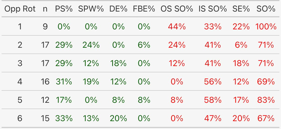
Nate provided the table below that shows the values explained above, their offensive reciprocals, as well as Service Error percentage (SE%). The data is broken down by rotation (US, not international). Under which circumstances is the serving team more successful? Where might they look to upgrade?
In terms of PS%, rotations 1 and 5 seem to be underperforming relative to the others but there are subtleties in how they are underperforming. Rotation 1 doesn’t need much deep analysis, zeros are zeros. But, notice that the receiving team scored 44% of their points against this rotation while out of system. Couple that fact with 22% SE in that rotation (for a total of 67% of opponent scoring) and it becomes likely that the server in this rotation is being aggressive but their team isn’t reaping any benefits from the efforts to get the opponent out of system. The metrics are saying that this rotation is struggling the most when the receiving team is out of system. Rotation 5, on the other hand, shows something different, this rotation is struggling more when the receiving team is in system. Against this rotation, the receiving team only scored one point when they were out of system but seven points when they were in system. This information suggests that the server can afford to be more aggressive in an effort to create more out of system receptions. Hopefully, being more aggressive at the service line will increase the team’s SPW% in that rotation. In a similar vein, rotation 2 is a rotation with relatively high SPW% and low SE%. This data suggests that the server may be able to be more aggressive to great effect but it also suggests that more can be done to defend against in-system attacks since DE% is at zero.
What’s a coach to do with this information? If a team is doing well in one partition but not the other, then that team can try to address the difference with better serving or better defending. If a team is doing poorly in both partitions, then even if the service pressure increases, the team still needs to defend better in that rotation, no matter what. Coaches may ask questions like who are the defenders and how are they defending attacks that commonly happen, particularly when an opponent is either in system or out of system. To help shape the questions coaches may ask, Nate recommends looking at other metrics, as demonstrated above. In the rotation 1 example above, the server’s SE% was mentioned. If they miss often, then maybe the best alternative is to use a different server rather than demand that the current server serve tougher. In the rotation 5 example, out of system percentage was mentioned in order to assess how often a server is creating pressure situations for the team, which gives a way to assess if that server needs to serve tougher or if the team needs to defend better. Further, a coach can use this information for scouting as well. If you have this data for an upcoming opponent, you can look for opportunities to increase your point scoring opportunities. For example, if you see that a team struggles to score out of system in a particular rotation, you may be able to construct a serving strategy to exploit that deficiency.
You may have noticed that Nate’s table includes offensive stats along with the defensive stats that were described at the start. In that table, the offensive stats were shown to complement and support the defensive stats. Although not a way of using DE%, SPW%, and FBSOE% that Nate relies on, he pointed out that, while these metrics were developed from a serving/defensive standpoint, they can also be used to measure a team’s ability to side out in different situations. Instead of beginning with PS%, start with its offensive equivalent, side out percentage (SO%).
The SPW% equation looks the same but changes which team’s wins are counted.
Same idea with DE%, but I have changed it to OE% for “offense earned”.
Their usage is the same and the questions asked are barely different. Instead of asking if the team can upgrade its serving, a coach might ask if passing needs to be upgraded instead. Rather than ask if the team needs to defend better, a coach might ask if the team needs to manage its OOS attacks better. Nate pairs offensive SPW% and OE% with setter coordinates (where the setter was located on the court when they set) and offensive distribution metrics to help him diagnose if the issues are with attacking matchups or with setter distribution.
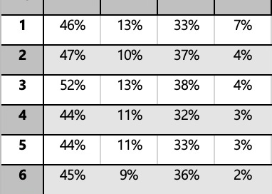
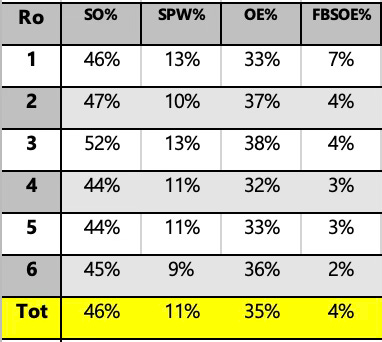
Here is a table similar to the previous examples, but using offensive SPW% and OE%. What areas stand out to you as in need of attention? What appears to be going on? Where would you look to upgrade or make changes? What other data would you want to make better decisions?
Regardless of if the metrics are used to evaluate a defense or an offense, they should be paired with other metrics to create a more complete picture of what’s happening.
None of these metrics exists in isolation, none tells a sufficiently complete story by itself. At the same time, having too many metrics or too many partitions in the same data can, according to Nate, “spin coaches out”, meaning that they can lose sight of what the analyst is trying to show with the data and lose interest altogether. It’s a difficult balance but one that drives a lot of the work Nate does. Years ago, he said that one of his driving questions was “how do I tell the story of the match with context but without overwhelming?” I think Nate’s search for that balance, while also searching for more ways of providing context, is crucial to the work that analysts do.
Have questions for Nate? You can ask me here or you can contact him on Twitter/X.


