Behind the Laptop Week 7
If you’re interested in watching any of our matches, all of them are on ESPN+
Friday 10/11
In a break from the “write on Thursday” streak, it’s Friday and I’m at home, having just finished packing for our road trip. We leave this afternoon for a Sunday afternoon match. We’ll return home in the evening after the match, spend all day Monday in Colorado, then leave Tuesday for our next road trip. It isn’t a fun schedule but at least the student-athletes were able to get a full week of classes in this week before missing most of next week, since we won’t return home until Saturday.
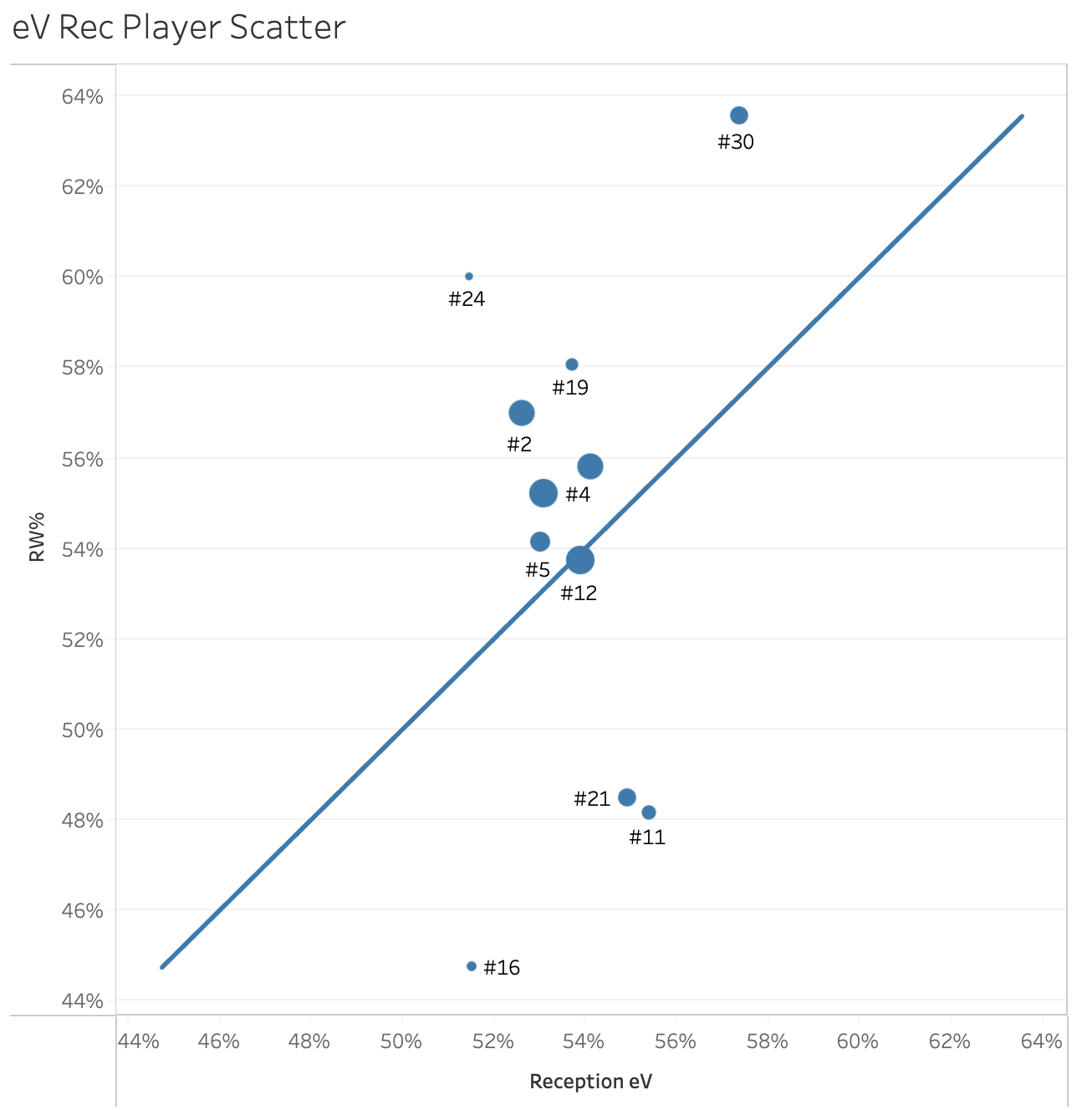
In my week 3 post, I showed a table of opponent reception metrics that I use to guide me towards decisions on serving targets. Today, I’m following up with a visualization of some of the data in that table. The scatterplot below appears to show two metrics, Rally Win % (RW%, which is the percentage of rallies a player’s team wins after that player receives serve) and Reception Expected Value (eV, the percentage of rallies a player’s team is expected to win after that player receives serve). But it actually shows 3-4 metrics. That’s the beauty of visualizations: if you’re careful, you can pack more information into them without being overwhelming.

Before I get into what the third and fourth metrics are, let’s spend a moment on the metrics that appear on the axes. Reception eV, while designed to tell you how often you should expect to win a rally, also gives you some sense of the quality of situation being created as well. The higher the eV, the better the average situation the passer is creating, meaning that the passer is, in theory, making it easier for their team to score. In contrast, RW% doesn’t tell you if the passer created a good situation or not, it just tells you how frequently the passer’s team scores when they pass. But, if the logic about eV holds, the better the RW%, the better the average situation created. Nonetheless, it is worth pointing out that the correlation between RW% and good situations is not as tight as the correlation between eV and good situations. If you care about scoring points, then that difference in correlation doesn’t matter as much as winning rallies, regardless of what those rallies look like. The difference between eV and RW% is the difference between should and does, and I tend to care more about the latter if you force me to choose.
One of the metrics I’ve hidden in this plot is the number of receptions. The size of the mark denotes the relative number of receptions, so the players with the largest marks are those who receive most often. If I’m picking serving targets, I don’t get too excited about serving players with small marks because they likely are hidden in serve receive or don’t play as much as others with larger marks. Every once in a while, there are players that just don’t get served as much, despite being players that I would target. I wouldn’t say that choices like these are counterintuitive, but I would call them less intuitive. But that’s what can come from looking at non-traditional measures of performance.
You may have noticed the diagonal reference line in the plot. The line, which shows where RW% = eV, gives a measure of how a player is doing relative to expectation. This is the last measure I’ve hidden in the plot, Value Above Replacement (VAR). VAR is just eV minus RW. In some respects, VAR isn’t helpful in selecting serving targets but it is interesting to note. The greater the distance between the mark and the diagonal line, the larger the VAR. A player like #12 is, by this measure, average. Their eV, or how often their team expects to score when they receive, is equal to their RW%, or how often their team actually scores when they pass so their VAR is zero. Players like #16 and #30 highlight when VAR is large. In #16’s case, their team actually scores far less than expected (negative VAR) while #30’s team scores far more than expected (positive VAR). So while it’s interesting to note which players have negative or positive VAR, I’m more likely to pick targets based on who has the lowest RW% and has the largest mark.
An important thing to note is that my plot is skewed because neither axis includes zero. Starting each axis at 44% allows me to separate the marks for better visual clarity but doing so gives the illusion that the players in the plot are separated by more than they actually are. Noticed that all players (except #30) are between 51% and 56% eV and 2/3 of them are between 53% and 55%. Statistically, it would take a large sample size to differentiate between them and, even with all those receptions, it’s doubtful that you could tell the difference between them just by watching them play. There is more separation between the passers when measuring their RW%, but it’s still exaggerated by clipping the y axis. Six of the eleven passers shown are between 53% and 58%. The difference matters, but that difference is still hard to spot in practice.
But this difference is what I’m trying to capitalize on when selecting serving targets. How and when can my team serve at players like #11 and #21? If I can’t serve at them very much, who do I want to target next and why? As I said in that week 3 post, I don’t like to rely on a single metric when making decisions so I’m not going to use this plot by itself. But I do like it because it sums up a decent amount of information in an elegant way. It’s something that I can hand to a coach and not have to explain too much. The plot explains itself, which is something I’m always striving for in communicating about data.


